
Insider Newsletter #309
Gold is surging, trust in institutions is collapsing, and the next market cycle is taking shape. Where should you be positioned before the herd wakes up?

Greetings, friends! We recorded a little bonus for this issue, where we dig into some of the topics covered in the Newsletter. Click here to watch it.

Koh Phi Phi from Masashi.

Sticking with Thailand, this one is from Gerolf. The Chao Phraya river in Bangkok, passing Wat Arun (the temple of dawn).

Quote of the week:
“It never was my thinking that made the big money for me. It always was my sitting. Got that? My sitting tight!” - Jesse Livermore aka Lawrence Livingston, Reminiscences of a Stock Operator (by Edwin Lefevre)

A Technical Test
These charts below are the relative performances of two securities, both indexed to 100 at the start of the time periods.
Now, let’s play a game. We won’t tell you what the two securities are. You will have to read on to find out.
Here is the quiz… Just based on what you see in the charts below:
How out of favour do you think the relationship is?
Will the chart be materially higher, lower, or unchanged 7 years from now?
If you believe the move will be higher or lower, what do you believe the magnitude of that move to be?

Ok. Next one. This is the same relative relationship but showing a different time frame. To ensure we’re not playing with time frames to fit a narrative.
Ok, keep the above in mind and now read on. The answer to what these charts represent lies further down the rabbit hole of this issue.
When Trust Erodes
There is a lot going on. Too much, really.
The USAID revealing US taxpayers’ dollars were funding satanic pedos, colour revolutions, and tranny shows in Serbia (no kidding!)… and the alphabet crowd and, and, and…
What else? Ah, social security, one of the biggest frauds out there, is found to be paying out to 21 million folks over the age of 100. Hahaha!
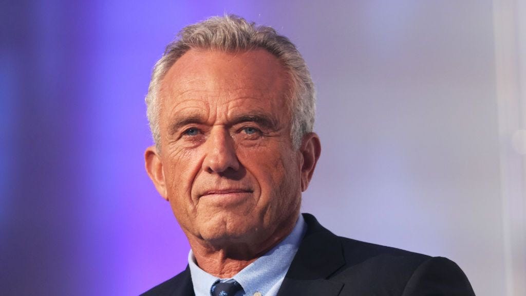
Then there is the appointment of a “conspiracy theorist anti vaxxer” as the head honcho of America’s health agency.
The communist class are in flat out panic mode. I’ve not looked, but I know what I’ll see if I turned on the idiot box and mainstream media.
There’d be some shiny-toothed news anchor who will be proclaiming that Americans are all going to start dying en masse now…
…especially if they stop taking their vaccines.
Then there’ll be some studious looking “scientist” backing up the stated claims.
And finally we’ll break to a commercial where a Middle Eastern looking man will be smiling next to his African American wife and their 3 Scandinavian children.
Probably they’ll be driving a Tesla, too.
The ad will be selling you nut milk, which isn’t milk at all — just dirty tasting water… or fake meat patties for your burger.
It’s all too tiresome and ridiculous at this point. To be honest, it’s taken all the fun out of propaganda.
Who can remember when we had to actually think about the content being spat out at us and then go verify it to identify if you were being sold porkies or not?
Now it’s as if they’re pushing the envelope to see just how thick and gullible Joe Sixpack really is.
But it’s like shooting fish in a barrel. Boring!
Anyway, anyone with half a brain should know that many of these “aid agencies” and NGOs are simply fronts for the intelligence community so the following detail of how USAID is operating in Cairo is illuminating to those who might still be suffering under the illusion that this is anything other than a money laundering scheme for the deep state.
DOGE is now finding all sorts of shenanigans and taking away rice bowls left, right, and centre.
It’s enough to fill entire pages with, and so instead I will ignore it and move on, because the real meat of it is this:
What we’re watching is a broader understanding that these institutions that many believed in are as corrupt as the Clintons.
And this is the perfect environment to think through what happens when society no longer trusts.
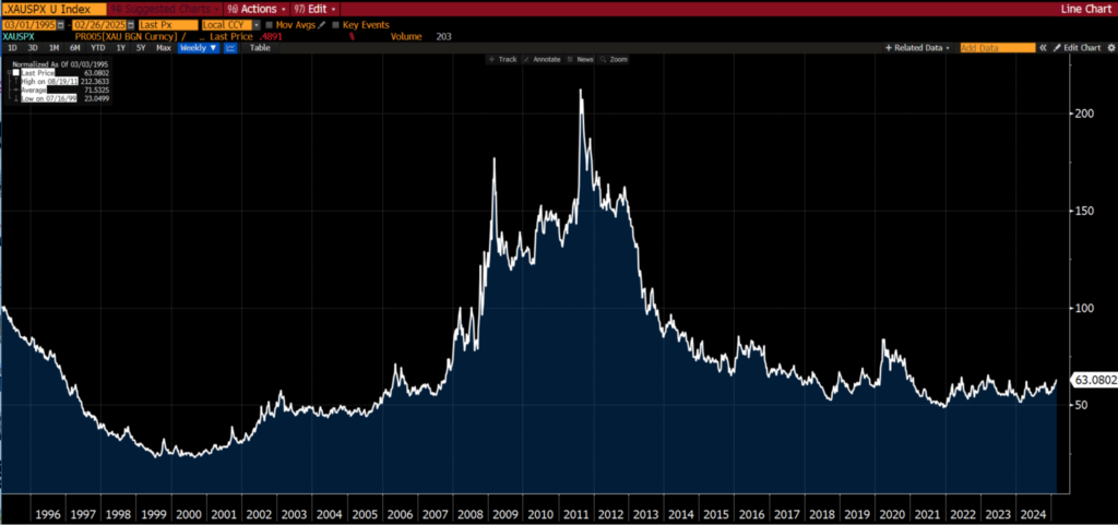
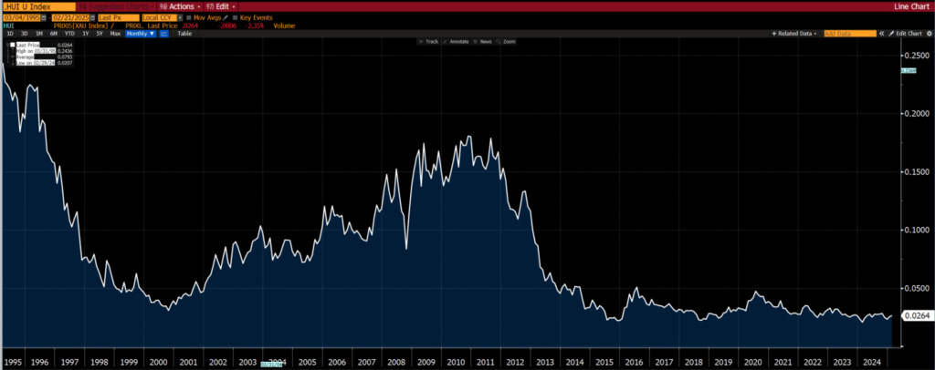
We have written about it in the last few issues pointing out the anomalies and highlighting that something is up — gold being the marker.

That, my friends, is a solid bull market.
It has been running like the police are after it. We spent a lot of ink in the last issue highlighting the divergence between gold and gold equities, so this is merely to restate that you want to own both… and in decent size.
Gold has been moving with global central bank buying, but institutional participation is still missing (as is retail).
That means the real bull market lies ahead. It also means that the equities relative to the physical are even more underowned.
Keep in mind that central banks don’t buy gold equities. This is why gold has been running with the equities hardly moving.
We believe that when institutional money enters the market, it will swiftly be followed by retail, and both of these will buy the equities as well as gold. The time to own anything is early.
MORSGA (Make Our Russkie Stonks Great Again)
Take a look at this US State Department statement…
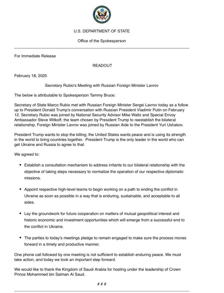
That, my friends, is the precursor to having all our Russian stocks freely traded again.
This, of course, is a follow on from JD Vance flying to Munich, settling in, shaking hands, and then going full napalm on the communists in Brussels, singling out the technocrats in Davos and berating them for stealing the Romanian election… and much more.
If you haven’t watched it, grab some popcorn and watch it here.

The silence and shock in the crowd of pointy shoes is what is most satisfying.
The reason to point this out is that as we’ve been saying for a long time here, the cycles of history repeat, and in this fourth turning we’ll see old alliances fracture and break and new ones form.
The relationship between the Brits and Europe and the US is pretty combustible right now.
That doesn’t bode well for European equity markets, especially when the Europeans are doubling down on stupid.
It is for this reason (amongst others) that we find it problematic to be bearish the US dollar as we think capital will still look to the US compared to Europe.
Another Green Darling Bites the Dust
Check this out…

Electric truck maker Nikola, which briefly boasted a market value above Ford Motor before its founder was charged with fraud, filed for bankruptcy after struggling with high costs and a trucking industry reluctant to abandon diesel engines.
Nikola said it plans to wind down operations. Its rapid rise, with investors embracing the promise of environmentally friendly vehicles, was followed by a steep decline as the company stumbled trying to fulfill the lofty promises of its founder and former chief executive, Trevor Milton.
All the hallmarks of hysteria. Lofty promises and a market cap exceeding industry.
Investors with rose coloured glasses.
It was all codswallop, and we stated as much, keeping in mind that a big part of successful investing lies in what NOT to do just as much as it lies in what TO DO.
What NOT to do was to invest in a hyped up nonsense stock such as Nikola… and so we pointed it out.
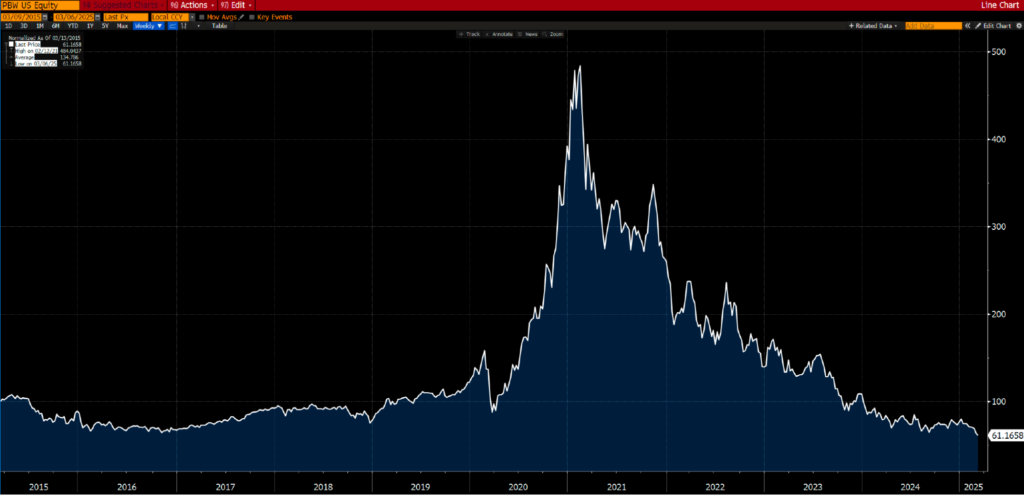
Yes, Nikola was once closing in on a $30 billion market cap. It’s now some $15 million.

While on the topic of silliness, here is a wonderful chart showing the “clean energy ETF,” Invesco WilderHill Clean Energy ETF (PBW).
So the question now is this…
With the bollocks narrative around “renewables” collapsing in real time — as we promised you it would — what then is the alternative if renewables are not going to do the trick?
Is there some new, yet unheard of savior in the wings… or are we back to dirty old coal, natural gas and oil? Probability clearly favours the latter, and hence our positioning here.
Throw into the mix the fact that capex in the “dirty energy” space has been curtailed massively and the very real and uncomfortable fact that supply doesn’t just come gushing out of the tap when the green haired vegans decide to ignore Greta and turn it back on, and I suspect the next few years will bring about a broad awakening. Time will tell I guess.
Speaking of which..
US Shale: Like Your Mother-In-Law
It’s true. US shale is becoming gassier. A hat tip to HFIR for continuing to highlight this development in US shale. It’s associated with the maturing of fields.

Few are talking about this development, but it is critical in understanding the ability of shale oil fields to grow.
Oil companies can drill as much as they want, but this isn’t going to result in any meaningful increase in production. Perhaps all it will achieve is to maintain current production levels.
Sooner or later, there will be negative surprises with US shale oil production. In the meantime, we remain patient.
A Financial World of Extremes
As each year passes, we have come to appreciate Bob Farrell’s 10 Investment Rules. Perhaps this is because we have been through “a few” cycles and have seen his “rules” play out:
Markets tend to return to the mean over time.
Excesses in one direction will lead to an opposite excess in the other direction.
There are no new eras; excesses are never permanent.
Exponential rapidly rising or falling markets usually go further than you think, but they do not correct by going sideways.
The public buys the most at the top and the least at the bottom.
Fear and greed are stronger than long-term resolve.
Markets are strongest when they are broad, and weakest when they narrow to a handful of blue-chip names.
Bear markets have three stages — sharp down, reflexive rebound, and a drawn-out fundamental downtrend.
When all the experts and forecasts agree, something else is going to happen.
Bull markets are more fun than bear markets.
Granted, these are all rather subjective general “rules”. In hindsight one can see them working, however, when you are in the “here and now” it is always somewhat more challenging.
When you identify a condition of “excess,” there is nothing to say that these excesses will end shortly thereafter.
Excesses (new highs or lows) or a topping/bottoming process can go on for a lot longer than you could ever rationally comprehend… as you will see in the charts below.
But eventually, these excesses do come to an end for reasons you probably didn’t think of at the time. The returns generated as they mean revert provide such beautiful asymmetry.
Take a look at the “excesses” occurring in macro investment themes listed below (no prizes for guessing that we are positioned for a reversal of these trends).
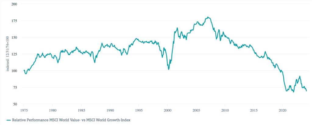
Value vs Growth
First, let’s recap on the essence of value vs growth:

One could say that the difference comes down to growth expectations. In other words, growth of future earnings.
In the US, “value” as an investment theme relative to “growth” is more or less at a 40-year low.

From a global perspective, value is as out of favour as it has ever been since the early 1970s and far eclipsing the records set during the dot-com lunacy 25 years ago.
It would be interesting if the chart below went back another 50 years.
It is not just a large cap thing. The same also extends to small caps.

What few have thought about is the ability of “growth” stocks to grow. Many of these companies are now bigger than entire national stock markets.

The Magnificent 7 now account for an eye watering 25% of the market cap of the world stock market (MSCI World).
Surely, the growth rate of these stocks must revert to that of the world stock market?
Well, we think so.
We believe growth expectations of the Mag 7 will go down as one of the grandest of delusions of all times.
Imagine companies becoming larger than countries (when measured by market cap), and furthermore, consider how probable it is for these companies to grow faster than GDP growth rates of countries.
Let’s put it in a slightly different way, for Microsoft to double in value, it needs to attract the same value as the entire French stock market (thereabouts).

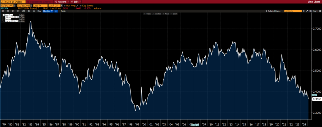
Small Caps vs Large Caps
Small caps are about as unloved as they were during the height of the TMT bubble in the late 1990s.
World vs US Equity Markets
An extreme? Hard to argue that it isn’t. The only debate is the magnitude of the extreme.

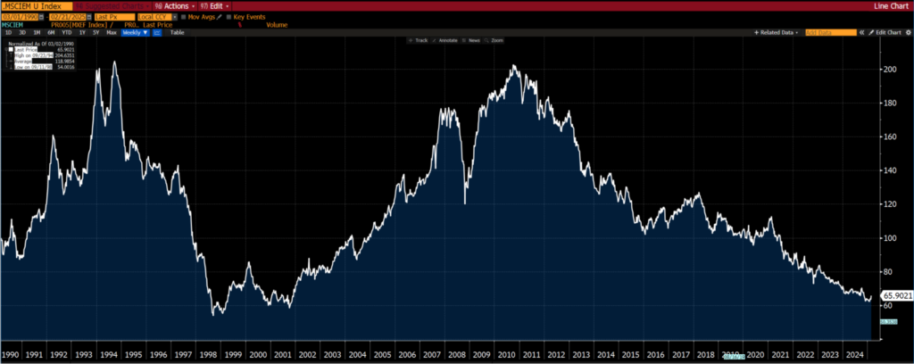
Emerging Markets vs World Equity Markets
Emerging markets are as out of favour as they were in the late 1990s, after the Asian tiger and LTCM crisis.
Energy vs S&P 500
From a sector perspective, energy has never had such a low weighting in the S&P 500. The chart below (the longest time frame we could find) only goes to mid-2020.

However, if we look at the relative performance of the S&P 500 Energy sector and the S&P 500, you will see that the performance is comparable to 2021 (i.e. the weighting of energy stocks in the S&P 500 hasn’t changed much since late 2020).

Gold Miners vs S&P 500
Almost a replication of the chart above, but notice the long term bottoming formation.
And mining stocks (the S&P 500 Metals and Mining Index which the XME ETF tracks) relative to the S&P 500.

Energy vs Mining
The foregoing discussion begs the question, is energy more out of favour than mining?
If you want a yes/no answer, then yes. Value is easier to find in energy oriented sectors rather than mining.
However, if you give a time frame then things are not black and white. Over the last 10 years, the answer is still yes. But over 20 years and more, there isn’t a clear winner/loser.

Commodities vs S&P 500
To round it all off, taking the S&P GSCI (the Goldman Commodity Index) as a proxy for the commodity sector (only because it has the longest history)…

Taking the last 35 years, commodities relative to equities are as toxic as they were in the late 1990s. We remember that time. No one wanted to touch them with a 40-foot barge pole, least of all commodity sensitive stocks.

Of course, there is this famous ultra-long term chart produced by Goering and Rozencwajg:

And this one:
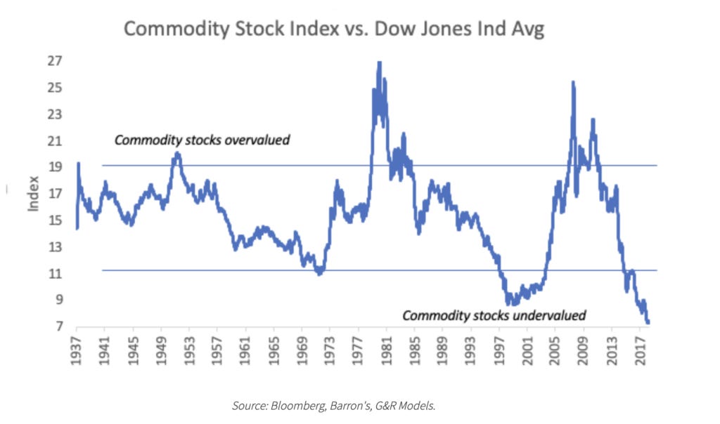
Granted, it is some five years old but levels have not changed any since then (using charts above as a proxy).
So in light of the charts above, what is the market implying?
In essence, the market is as perfectly positioned for benign inflation and relatively low interest rates over the next decade as it has ever been over the last couple of generations (at least).
One could also say that the market believes that the inflation we have observed since COVID is transitory and interest rates will be lower a couple of years from now.
Under conditions of low/benign inflation or deflation, commodities and commodity related equities underperform the general equity market (take the S&P 500 as a proxy for the general market).
So if you believe that inflation will surprise to the upside, then you should have a heavy bias towards commodities or commodity sensitive equities in your portfolio.
You get a fair appreciation why our portfolios have almost entirely weighted towards emerging markets, value, and commodity sensitive stocks.
We didn’t so much as look from the top down and decide we want to be these sectors/markets/themes, rather they came up as offering fantastic value from a bottom up perspective.
However, from a top down perspective (as in looking at the charts above), we gain an appreciation of the huge asymmetry offered in these sectors/markets/themes.
Of course, it is all easy from an armchair. But when you are at the coal face and patiently waiting, that armchair does start to resemble a rocking chair.

A good moment to remind ourselves that good things take time.
Gold vs S&P 500: The Canary in the Coal Mine
Remember the quiz about the two securities at the start of this publication?
It was gold and the S&P 500, specifically gold vs. the S&P 500 indexed to 100 at the start of the time period.
So when it is rising (however you define “rising”), gold is outperforming the S&P 500 and vice versa.
Notice the duration of the trends, and don’t be too clinical in terms of how one defines a trend — just eyeball the chart. Trends tend to last for 10 years at least.


Yes, gold really did go up some 7x relative to the S&P 500 from 2000 to 2012.

Is that a bottom being hammered out ever since 2018? Over the last three years, it does look like that trading range is compressing.

Putting on our “technical analysis” hats…
Given…
the length of time for which gold has underperformed the S&P 500 (15 years),
the magnitude to which gold has underperformed the S&P 500 (50%),
the tightening of the trading range over the last 3yrs,
And how close gold relative to the S&P 500 is to breaking to a four-year high…
We believe that a bull market is on the verge of starting for which the duration and magnitude will surprise everyone (probably including ourselves).
At a minimum, we would expect to see gold up by 100% (relative to the S&P 500) come 2030.
At this point you may be wondering, where does the canary come into it? Gold typically leads the behavior of other commodities.

Notice the gap that has opened up between gold and commodity prices? We believe it will close by commodity prices rising to play catchup with gold.
Anyway, higher commodity prices mean higher inflation, which also means higher interest rates.
In that environment, you don’t want to be in growth stocks, least of all the Magnificent 7.
The divergence between gold and gold equities suggests a major move is brewing—one that could catch both institutions and retail investors off guard.
But what exactly will trigger the shift, and how can you position yourself ahead of the herd?
